Unity Technologies
EditorXR
Our open-source extension for Unity, EditorXR, was based on a simple, obvious ask: harness the power of virtual reality to allow creators to design and test their digital worlds, in that digital world.
Like most obvious things, it was surprisingly complicated.
Quick Summary
NAME
EditorXR
TYPE
Open-source package
USER
A Unity user with tethered VR
CHALLENGES
Object placement given unknown dimensions
Edit vs play mode in Unity
Can't change user's scene
Performance
New UI patterns
PROJECT LENGTH
12 months; ongoing
THE PROCESS
Our initial tiny team of two began work even before the tracked headsets arrived, in 2015. I started by interviewing anyone I could find working in the space to learn about workflows. (Voices of VR was a great resource.) We posted surveys on tooling on VR subreddits and forums.
The biggest ask by far was simply to be able to edit the scene in Unity in VR, so we focused on solving for layout first. This clear goal helped dictate our first round of features.
Above: early prototype of the Main Menu in C4D, directly lifting from Unity's icon design system.
Left (or above): Sketches of the controller schema and interactions.
Even before the headsets arrived, we spent time paper prototyping, 3D modeling and animating to figure out what Unity should look and feel like in VR. Of course, conce the headsets arrived, we realized that almost every design decision we made was either a bad choice, or unworkable. Dunning-Kruger at its finest.
This is the first lesson of good XR: design the medium in the medium as much as you can.
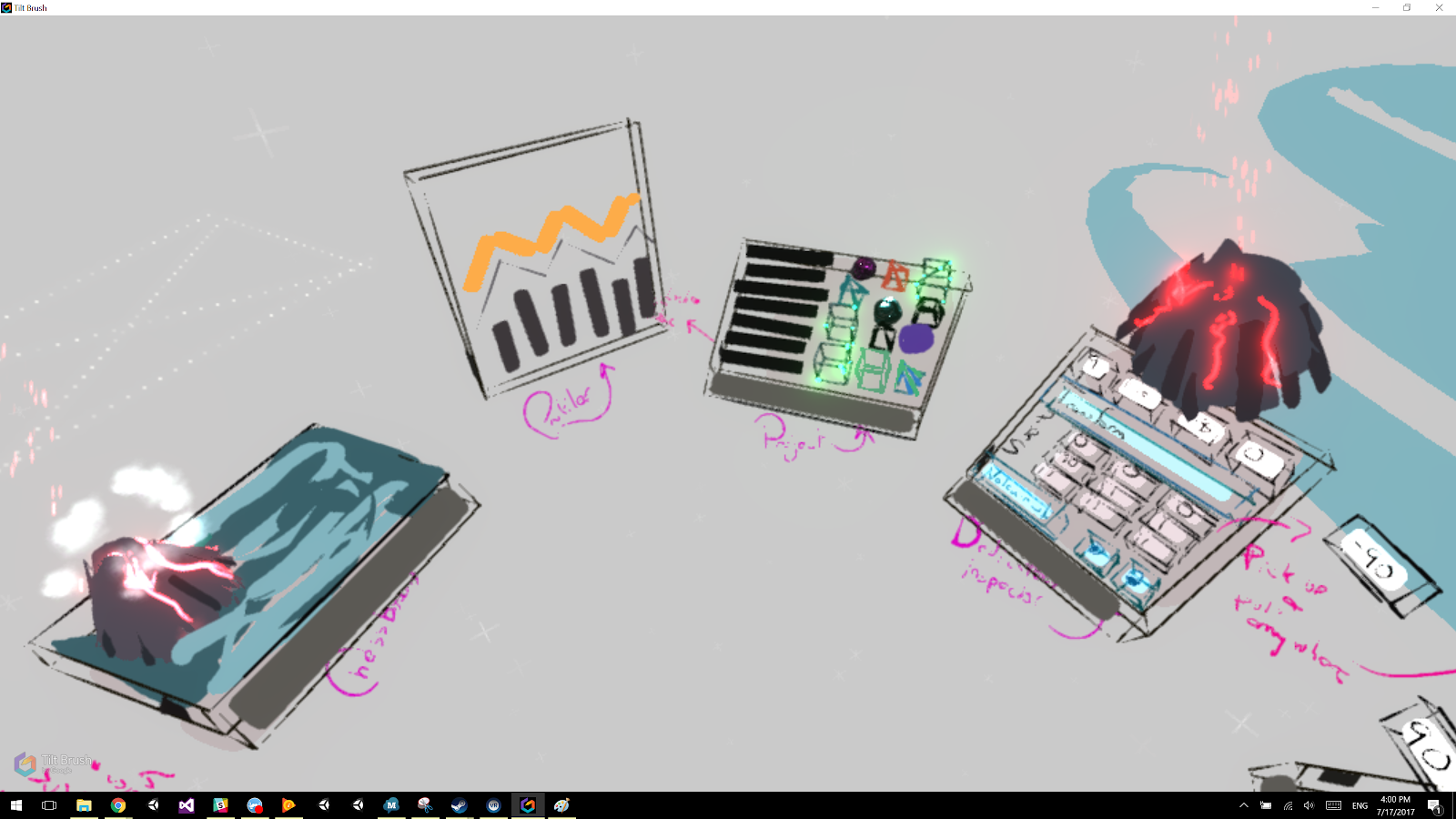
Not pretty, but it worked: the entire EditorXR UI system sketched out to scale in Tiltbrush, so the team could jump in, add notes, make changes, and see how it felt.
In order to make good decisions, you must try out the experience on the device it will run on. There's no other way to properly understand the limitations and actual user experience. That being said, once you get used to the medium, and once major design guidelines are in place, you can use whatever you have at hand to flesh out the product—and we used everything from Unity to Keynote to hand gestures.
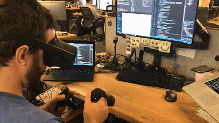
Once we had the base features, designs, and rough ergonomics fleshed out, we could move on to development and testing, testing, testing. We were targeting a very technically adept audience that would be used to highly customizable workflows and a wealth of actions available to them.
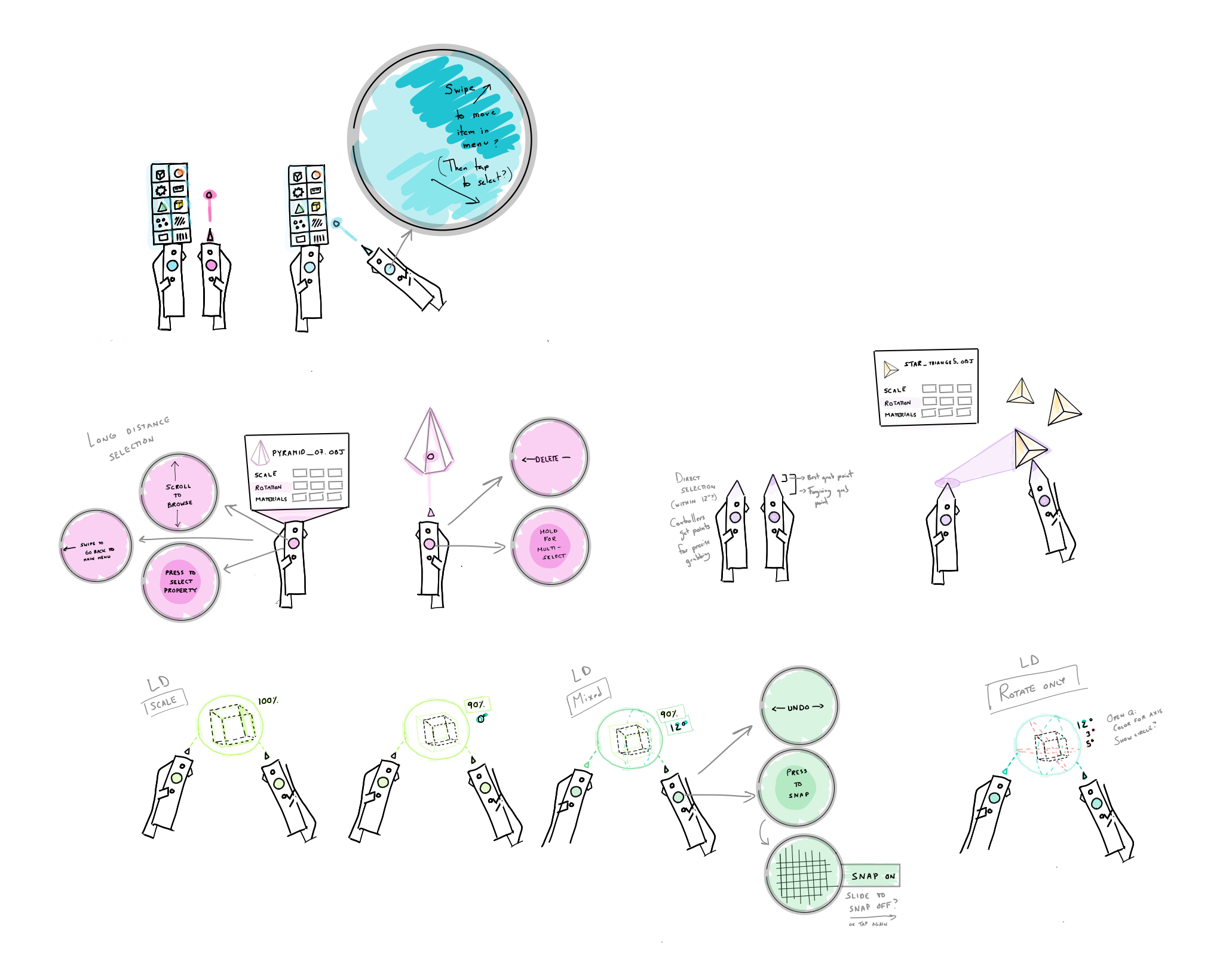
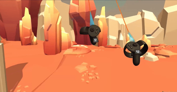
You can see what I mean here below: compare the EXR demo version of the controllers—simple button mapping—to one of the mid-cycle controller designs, with so many features we had a contextual menu UI attached to the model.
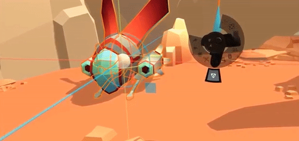
We also made design choices that seemed workable in principle, but simply did not feel good or work consistently enough with the hardware. For example, we found the error rate, hand size variability, and propreoception differences were all far too high to use this prototype concept (below) of the dividing the thumbpad into dedicated quadrants, even mapped to a larger UI above the controller.
THE CORE INTERFACES
Unity users perform an astounding number of interactions with a mouse and keyboard. We needed to keep at least some of that 'flow' with virtual reality controllers for our product to be useful. This means memorizable hotkeys: we can't require the user to constantly look at visual interfaces in order to provide input. Consider a keyboard or instrument—you go much, much faster once you've memorized what to do.
Our time working on inputs resulted in a useful guide to input mapping that is helpful to anyone who wants to map the actions of their app to controllers or inputs in the most useful way. You can find it here.
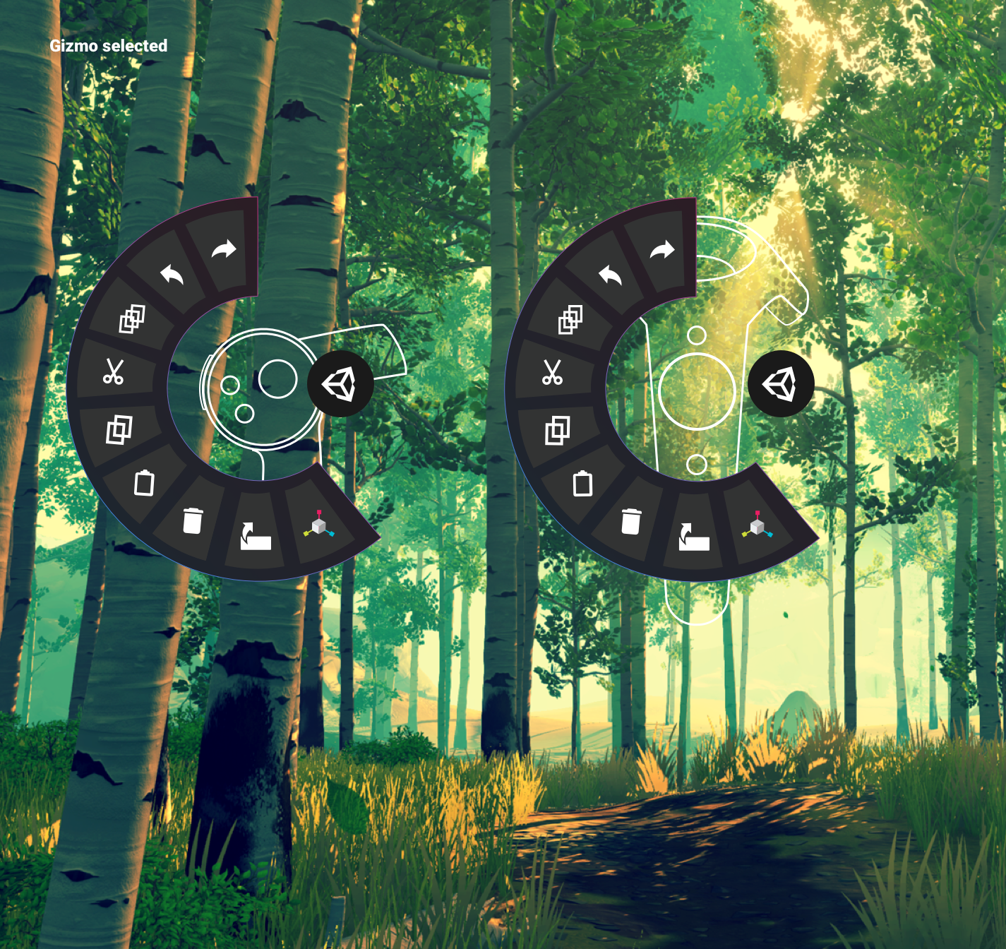
Above: The v1 release version of EditorXR's controller schema. By that point, with combination keys and contextual mappings, diagrams were useless.
Alongside controllers, we needed windows and menus to allow users to interact with project assets, lay out the scene, and move around their world. We called this set of UI "workspaces," both to avoid namespace collision with Unity's existing UI, and because they reminded us of workbenches.
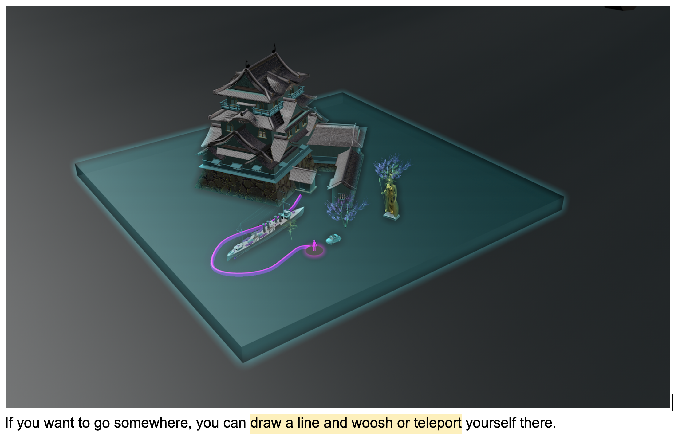
Above and right: early versions of the miniworld, now a part of all our XR tooling. Notice my terrible teleportation idea, left. This is why you gotta familiarize yourself with the medium, kids!
Workspaces proved to be a particularly fascinating challenge because they had to be big enough for reliable hit targets based on user error—and considering you're working off the forearm, the error region must be forgiving—but not so visually overwhelming you can't see what's going on in your scene. We ended up with a semi-transluscent UI language and depth hinting via shaders for buttons to give the feeling of interactivity without feeling overwhelming. This language extended across the entire UI.
We also did a tremendous amount of work on default size and rotation of the workspaces, ability to change size, angle, and orientation, politely moving workspaces aside as new ones were opened, saving workspace placement, how the workspaces 'follow' you based on your locomotion type, and allowing group workspace movement. This type of thinking deeply leads into a fundamental characteristic of good XR design: good feel.
BEYOND UI:
GOOD DESIGN FEEL
In all digital design, the interactions should be respectful, comfortable, and cover a wide variety of sensory input to cover user intent and context. In virtual & augmented reality, this means treating the user interface with the same care and attention you'd give to an animated character. Here's a list of examples.
OPEN AND CLOSE
In the same way objects don't suddenly disappear or appear in real life, digital objects must join and leave us in a way we can comprehend, and that feels comfortable. The treatment can be quicker and more elegant than physically possible, but we've learned objects simply must have some transition state in order for humans to even notice them. For EditorXR and the MARS companion apps, we use a combination: scale and movement , haptics, and sound.
SIZE
Size has four main considerations in XR: user comfort, display resolution, field of view, and finally, digital or real environment. Unfortunately, these extremely practical considerations leave aesthetics in a firm fifth place. A beautifully constructed piece of UI is of no use if it is stuck in a wall, unbearably large, or outside the FOV.
DISTANCE
Tightly connected to size, distance has very similar considerations, but user comfort comes to the forefront. This can be based on height or size, but also social norms and personal preference.
MOVEMENT
Movement is deeply tied to the levels of realism, and even the personality, you can give to your UI. Is it a part of your real or digital world, or can it pass through them, ignoring meshes or colliders? Does it react to objects, making space for new ones? Does it follow you, or maintain a fixed position? If you call it to you, does it come running, or leisurely glide over?
SOUND
Sound design plays an even deeper role than movement for both personality and realism. Sound is both an indication of physical events—in some cases, a proxy for haptics—and also a language in and of itself. Humans can memorize sounds unconciously and extremely quickly; this is extraodinarily useful, especially when used subtly for prompt, confirmation or error cues that don't need visual interruption or other sensory input.
HAPTICS
Haptics, like sound, are the best way to provide user feedback without interrupting flow. In fact, one can easily, and rightfully, argue that sounds are simply a subset of haptics. Haptics often are discussed in terms of controller vibration, but the hardware design itself, from the button travel to input placement to material texture, all fall under haptics in the user journey.
One thing we've learned from designing our XR tools at Unity is that proxemics can give us general guidelines, but the reality is that down to the last centimeter, humans feel differently about how they want their UI to behave. As a result, we have decided to make all UI animations, distances, and haptics strength customizable via settings in our XR HMD tools. It's a teaching moment for developers, and allows a level of context and comfort for the end user that is essential to good XR design.
OBJECT PLACEMENT
You might be surprised that object placement warrants its own section. There were a few reasons this was a particularly thorny problem for EXR. Unlike most apps, where assets are custom-made or edited to work together nicely, in Unity:
- Users can use any size asset, from needle to mountain, and we have no control over this, nor any information on it;
- Assets can be imported with misaligned pivots, offset centers, or other issues;
- Assets can't have colliders, so we need another way to calculate snapping and alignment;
- 'Alignment' can mean a lot of things. To plane? surface to surface? normals average? Physics simulation?; and
- We also need a consistent, yet distinct, interaction pattern system for interacting with UI that may or may not overlap with how the users interact with scene objects.
At the end of the day, we had to include a massive amount of options to ensure users could actually place objects where they expected. This was a hard lesson.
Here is the full list of snapping options included in EXR:
- Disable/Enable
- To Pivot/To Bounds
- Direction Selection
- Manipulator
- To Ground
- To Surfaces
- Rotate Object/Keep Object Orientation
- Limit Snapping Radius
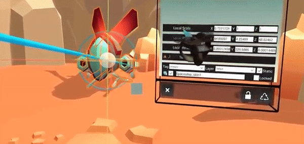
Size came into play in to ways: object movement, but also object placement. We needed users to be able to take an object out of the project workspace at a reasonable size to give visual feedback they had the object selected, then resize the object to its actual size once the user wanted to place it. This is simple for household-sized objects (eg, six centimeters to one meter). Beyond that, we have to move the object out so that the user's FOV isn't inside the object—meaning you can't see the object you're holding—or a large object is so close it feels bad and is hard to place correctly.
We used a simple algorithm based on object bounds to resize the object when the user was 'holding' it, then move the object to a distance from the user as the user placed it. Here's an example of this in action.
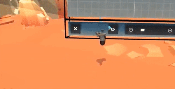
There are other considerations at play here that are shown in this video. First, we can't render every object in the project view for performance reasons—so you could only see 3D model on hover in the workspace. Second, you need to be able to see the selection highlight on top of all other elements in the scene—technically difficult in the Editor as it works today.
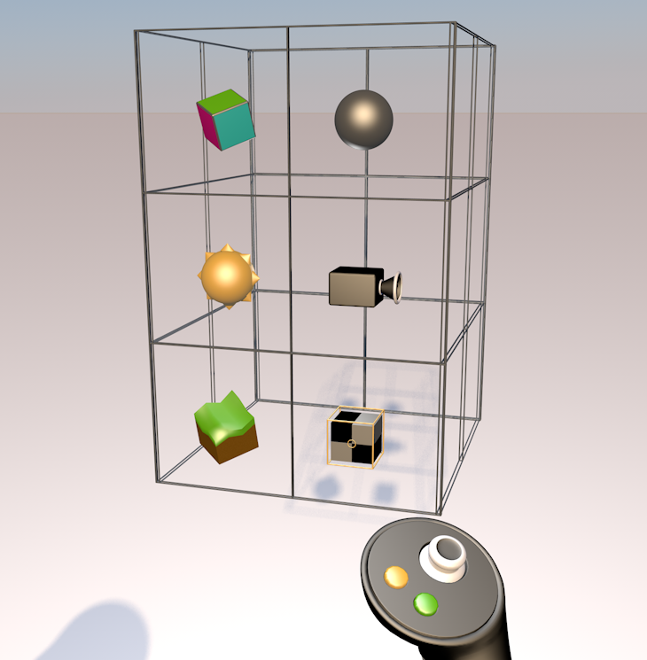
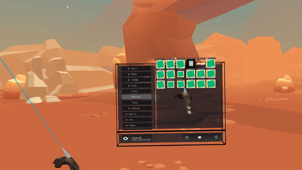
Finally, we had to figure out multiple ways for the user to actually move objects. We settled on three: freeform, direct manipulation by simply grabbing an object, longer distances with raycasting and a traditional 2D manipulator, and any distance with the Miniworld.
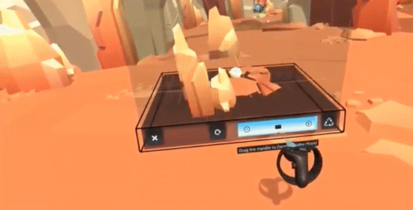
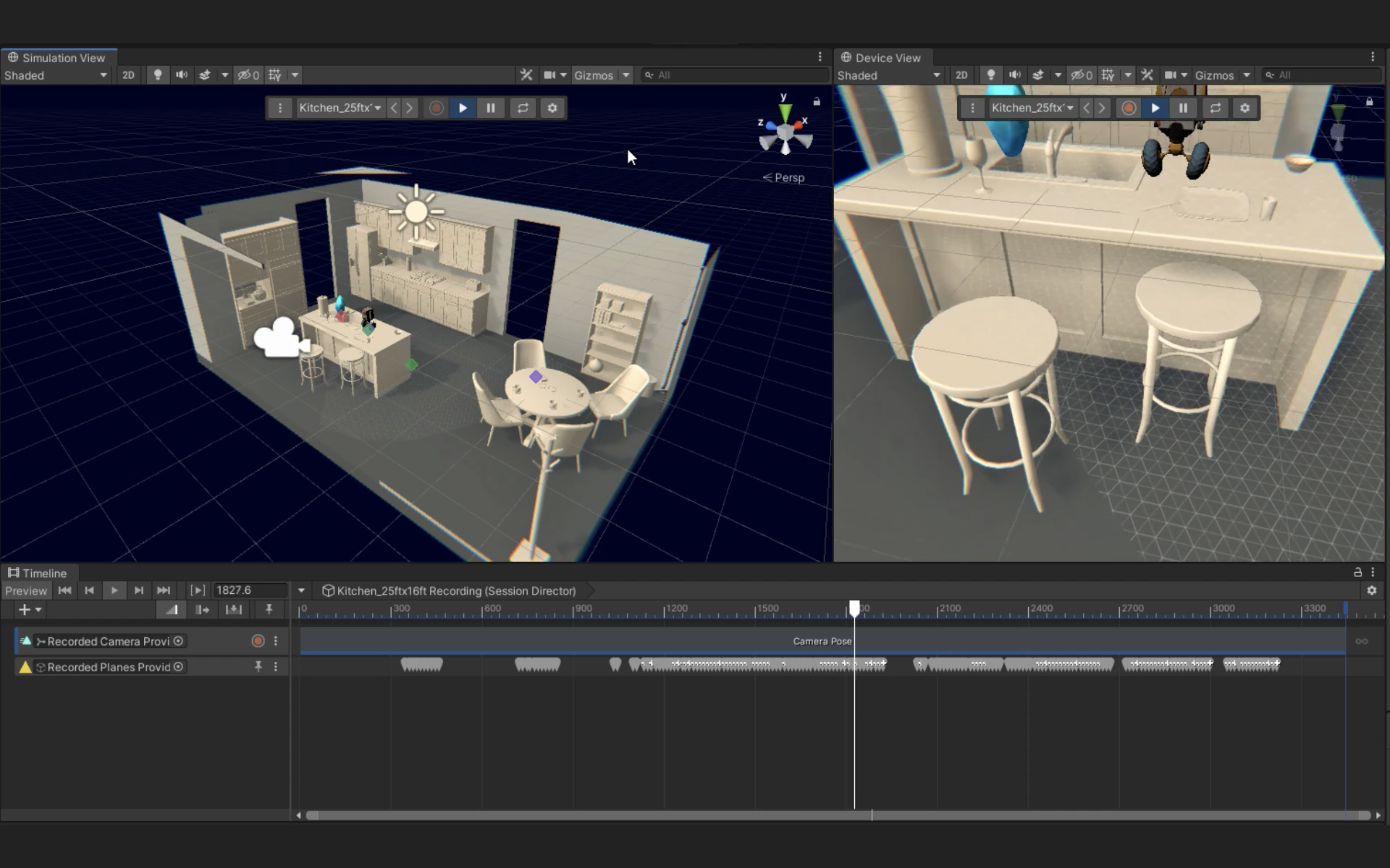
The Miniworld is simply another camera of your scene, and it allows you to scale, edit, move and place objects in the Miniworld, between the Miniworld and your current space, and between other Miniworlds. It's mindbending, but extraordinarily useful. Here's a video.
Since the Miniworld allows you to move any object into any other possible space in your scene, it allowed us to solve another hard problem: moving objects at a distance with a ray means you run into glancing angles—it's very easy to move an object very, very far from you accidentally, especially using the gizmo. With the Miniworld allowing users to move objects anywhere, we were able to put reasonable limits on how far the user could move an object with the gizmo.
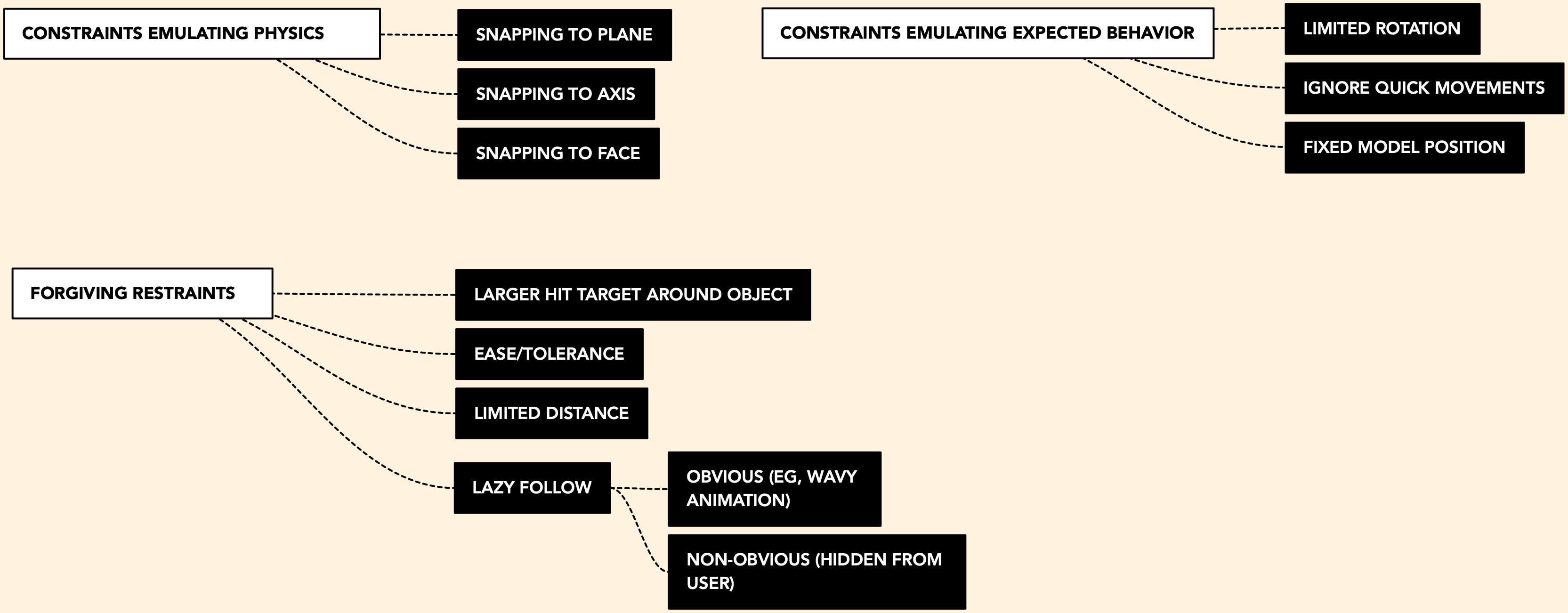
Below, you can see how we reasoned through different ways of constraints for object manipulation. Some were specific modes (eg, snapping) and some applied to different objects differently (eg, ease was different for the gizmo manipulation than large object selection).
OTHER FEATURES
There are multiple types of locomotion (blink, grab, worldscale, fly, and joystick). This is for two reasons: first, it allows the user to move around their world in the way that feels most comfortable to them and the scale of their experience, and second, it allows them to test out what type of locomotion might be best for their experience.
We also included basic greyboxing and primitive manipulation tools, and an annotation tool. Best of all, EditorXR is designed to be extensible. At launch, six companies created extensions for EditorXR, including sculpting, animation, multiplayer, and drawing tools.
EXR has also been an experimental playground for new types of interaction patterns beyond UI and into gesture, particularly using controller trajectory to create gestural 'hotkeys' rather than depending on button mappings. This is easier to try out than describe, but here's a video of it in action. The user presses a hotkey to enter a context menu, then simply moves their arm, freeform, to navigate the menu.
There's also quite a lot of work being done here around how the UI follows the users' gaze, or not, depending on HMD trajectory, timing, and distance of the instantiation to the selected object. Dylan Urquidi and the Advanced XR UI team continue exploring this new spatial design paradigm in Unity Labs.